In the digital landscape, understanding user interactions with online platforms is crucial for optimizing conversions. We utilized the Attention Insight tool, powered by artificial intelligence, to conduct a predictive eye-tracking UX analysis and understand how users perceive product pages in the largest Polish online bookstores.
Outline
Introduction
The goal of this article is to better understand which page elements effectively capture user attention on such marketplaces. The findings from this analysis can serve as inspiration for optimizing e-commerce services in your online store as well.
What was the subject of the study?
The subject of the study was to understand how users perceive product pages in the largest Polish online bookstores. The Attention Insight tool, based on artificial intelligence, was used to conduct predictive eye-tracking analysis. The aim was to identify elements that most effectively capture users’ attention and understand how these elements influence their interactions and purchasing decisions.
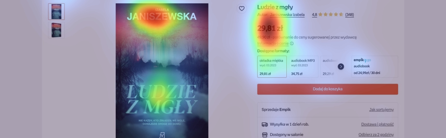
How does user attention distribute in the first 5 seconds of contact with a product page?
Heatmap analysis clearly indicates that book covers and pricing information are the elements that attract users’ attention almost immediately upon entering the page. These findings are understandable, considering that these are decisive factors influencing purchase decisions. However, it is interesting to note that elements such as reviews or book ratings are not always at the center of users’ attention, which may suggest that purchasing decisions are based on a broader range of factors.
How does the layout of elements on the page affect conversion effectiveness in e-commerce?
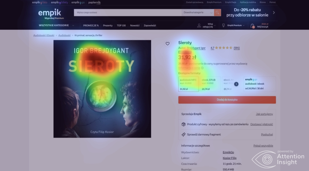
A key finding from the analysis is the importance of intuitive page design that considers users’ natural scanning paths. Services that place essential information, such as add-to-cart buttons or special offers, in areas naturally scanned by users have increased chances of conversion. Using bright, contrasting colors to highlight these elements further increases their visibility and likelihood of being clicked.

How to better engage the user on the product page in e-commerce?
User engagement metrics are invaluable sources of information, especially in the context of optimizing and designing product pages in e-commerce services. Heatmap analysis indicates that users often seek additional information, such as available book formats or shipping times. However, these crucial data for purchasing decisions are not always easily accessible or visible at first glance. Online bookstores that effectively place this information near the price and cover significantly increase user engagement, encouraging them to further explore the page and ultimately make a purchase.
The importance of layout and navigation in the e-commerce interface
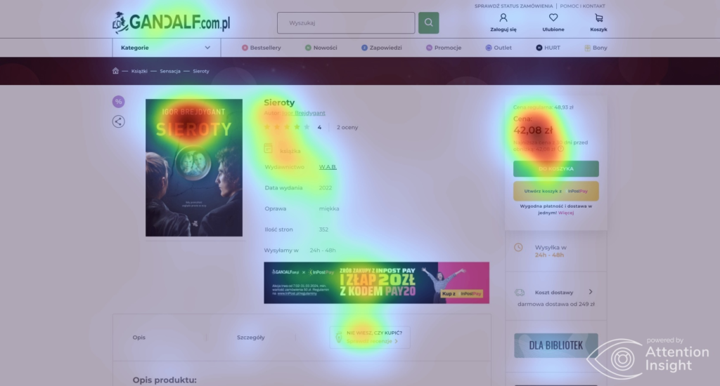
The layout and navigation on product pages of online bookstores are fundamental to providing a smooth and intuitive experience. Effective navigation should allow users to quickly find the needed information, such as book descriptions, reviews, available formats, and purchase options, without scrolling. Heatmaps suggest that pages requiring users to scroll intensively to find key information may negatively affect user engagement and interest.
How to design effective and visible CTAs?
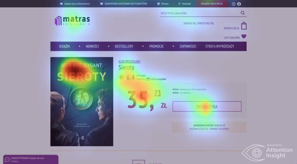
The visibility of calls to action (CTAs) is another crucial element that directly impacts the effectiveness of a product page. Buttons like “Add to Cart” should not only be easily noticeable but also designed to encourage clicking. Heatmap analysis indicates that the best-performing pages use vibrant colors, large typography, and contrasting elements to maximize the prominence of these buttons. This approach not only attracts user attention but also translates into higher conversion rates.
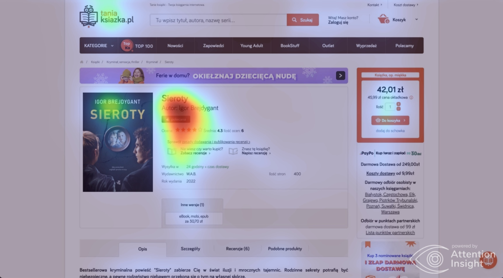
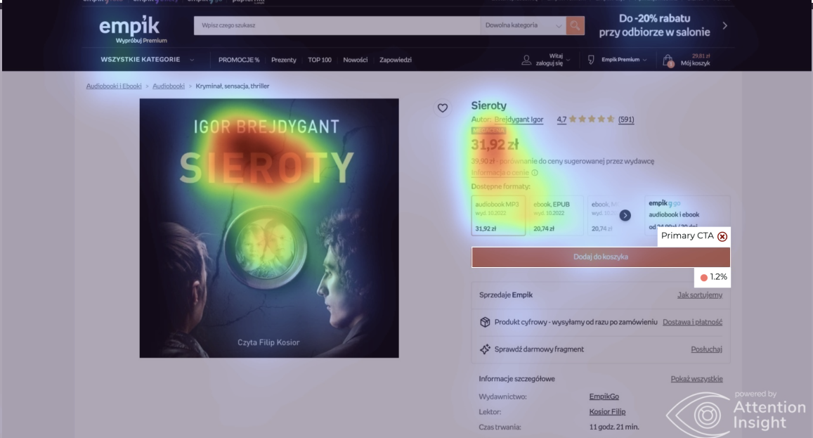
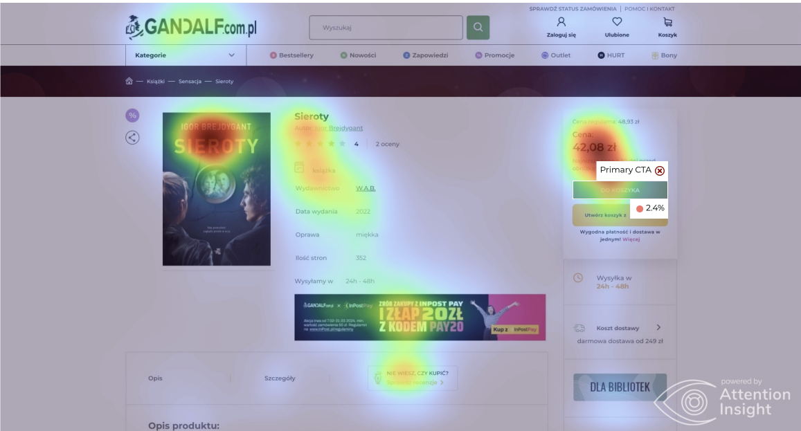
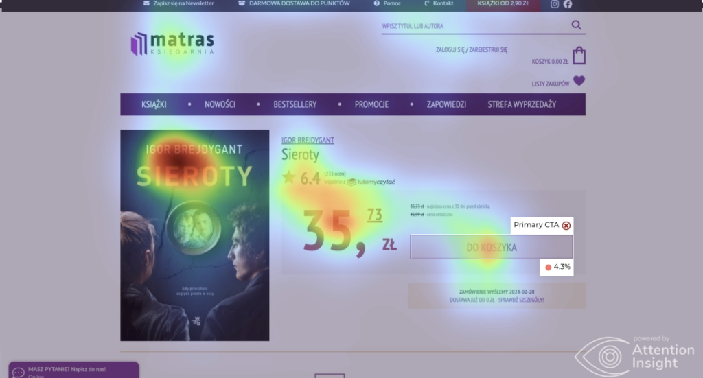
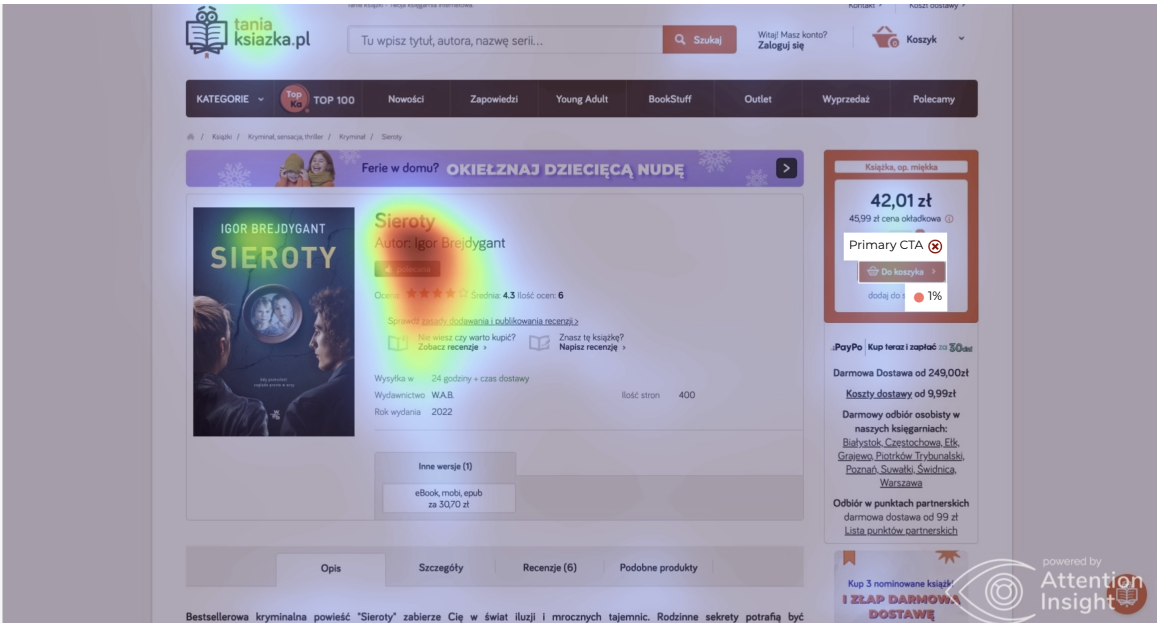
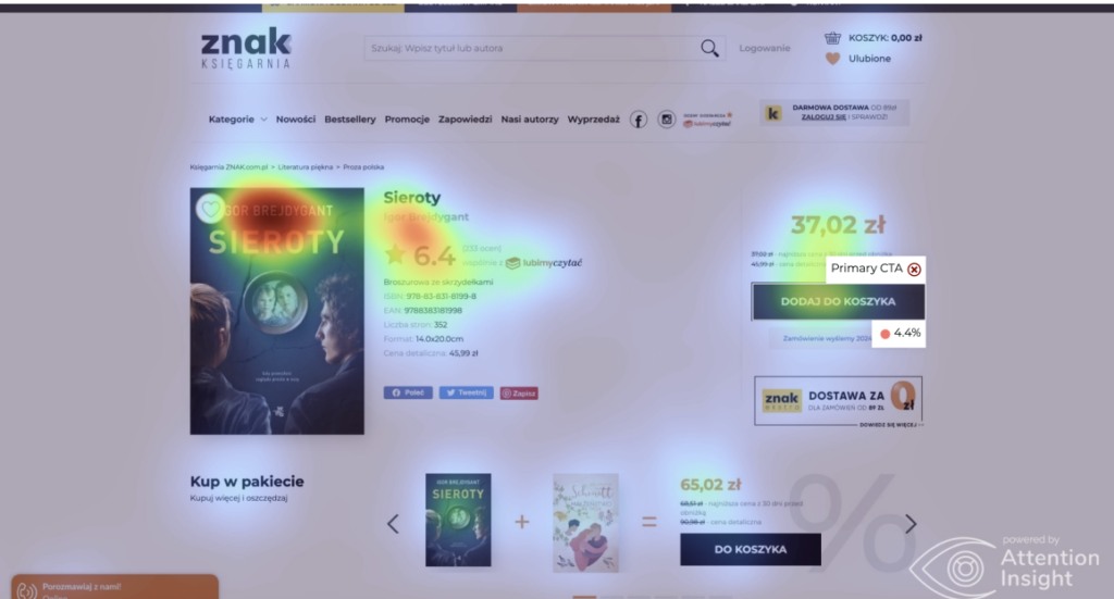
Translation of visibility indicators comparison for Primary CTA:
- Empik: 1.2%
- Gandalf: 2.4%
- Matras: 4.3%
- Tania Książka: 1%
- Znak: 4.4%
Conclusions:
- High CTA Visibility (Sign and Matras): These pages have clear CTA buttons with contrasting colors that stand out against other elements. It seems that the button’s location at the bottom of the product information block positively affects its visibility.
- Lower CTA Visibility (Empik, Gandalf, Cheap Book): The CTA buttons on these pages have lower visibility indicators, which may be related to their lower contrast against the background or more dense content around the button, making them less noticeable.
Factors influencing visibility:
- Contrast and button color: Buttons with bright, contrasting colors usually attract more attention.
- Button placement: Buttons placed strategically where users naturally end scanning the page (e.g., at the end of the price section or product information) have better visibility rates.
- Content density: Pages with minimal content density around the CTA button make it easier to notice and may attract attention more effectively.
What lessons can be learned from studying user attention in the largest Polish online bookstores?
Comparing heatmaps of various online bookstores reveals that some pages more effectively direct user attention to key elements than others. What distinguishes these pages is the thoughtful use of color schemes, graphics, and layout, which together create an intuitive and user-friendly environment. Better-converting pages not only attract attention but can also positively influence users’ subjective perceptions and purchasing decisions.
How can the findings from the study be translated into universal recommendations for optimizing product pages in online stores?
The findings from the analysis can be applied to other e-commerce sectors by placing product images and prices in visible areas, using contrasting colors and large “Add to Cart” buttons to increase CTA visibility, and placing reviews close to prices and product images. It is also important to clearly show available product variants and provide information on shipping times and costs near the price and images. Additionally, simplifying navigation and designing an intuitive layout can significantly enhance the effectiveness of e-commerce pages and conversion rates across various industries.
Conclusion
Understanding where user attention is directed on a page is invaluable for creating effective and engaging websites. Utilizing predictive eye-tracking analyses, such as those offered by the Attention Insight tool, can lead to better design, higher conversion rates, greater user satisfaction, and ultimately business success.
Consider how your website would perform in a similar analysis. Is it tailored to meet the expectations and behaviors of your users? Contact Codeq.pl to conduct a detailed study and optimize your online presence, which can significantly impact your conversion rates and overall effectiveness on the web.