CERI International Sp. z o.o. is one of the shared services centers of Commerzbank, headquartered in Łódź with a branch in Białystok. It specializes in handling processes for financial institutions, software testing, process automation, and customer data verification.
Outline
Goals of cooperation
The main goal of the project was to redesign the existing website, with the following expected results:
- Simplifying the service through optimization of elements such as information architecture and navigation, tailored to defined target groups.
- Optimizing the lead generation process in the context of generating inquiries in the recruitment process.
- Fixing errors through usability research and UX audit.
- Optimizing the website technically, with a focus on page loading speed.
Problems and challenges
- Effective recruitment in a challenging job market is one of the most difficult challenges that the organization faced. The solution to this problem was to properly investigate the needs of potential candidates and address them in the appropriate lead generation channels (job candidates).
- Ceri is a large organization, focusing on many stakeholders around it, so a significant challenge was the proper definition of information architecture and an intuitive navigation scheme that would support the exploration of the website, regardless of the context of the information being sought.
- Ceri, as an organization operating in the financial market, is required to adhere to strictly defined rules of operation. Therefore, a significant challenge was the proper placement of information and clauses required by law on the website.
How we solved the client’s problems
Project workshops at the client’s headquarters.
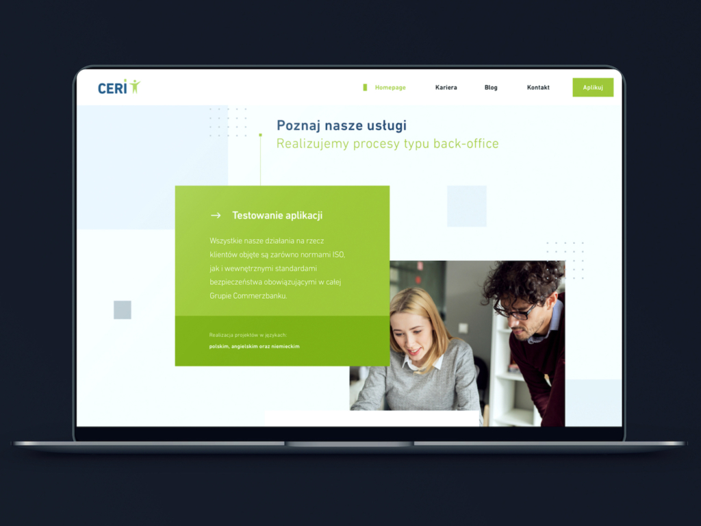
The key stage was strategic workshops, during which, together with Ceri’s marketing team, we defined the most important goals and outcomes we wanted to achieve through the new corporate website. This helped us understand priorities and determine where to focus when designing the new information architecture.
- Plan and goals: The workshops started with defining a clear agenda that included key points to discuss. The goals of the workshops included understanding the project requirements, the client’s business context, and expectations regarding the website’s functionality.
- Gathering information: The first step was to obtain feedback from individuals within the client’s team who had knowledge of the strategy, marketing goals, and target groups. This was crucial because the website had to be fully integrated with the marketing plans.
- Discussion of business goals: During the workshops, the main business objectives were discussed, such as increasing sales, brand promotion, acquiring new customers and employees, etc.
- Analysis of target groups: The next step was a detailed analysis of the target groups, their preferences, needs, and expectations. This made it possible to tailor the content and functionality of the website to specific audience groups.
- Competitive analysis: An important step was conducting a competitive analysis, which helped to better understand the broader picture of operations and draw conclusions about which functionalities and solutions are worth considering in the planned website.
- Discussion of functional requirements: The marketing department had certain expectations regarding the functionality of the website. These could include elements such as contact forms, portfolio sections, social media integrations, etc.
- Creative ideas and proposals: The workshops also allowed for generating creative ideas for presenting content, user interactions, and innovative solutions.
- Review of technical aspects: Although the main emphasis was on marketing aspects, it was also valuable to discuss technical issues with the IT team, such as the platform, hosting, performance, security, etc.
- Planning project stages: At the end of the workshops, project stages, deadlines, and priorities were defined. This allowed for establishing a clear schedule of work.
- Creating documentation: Based on the discussions during the workshops, project documentation was created, serving as guidelines for the team working on the website.
UX analysis
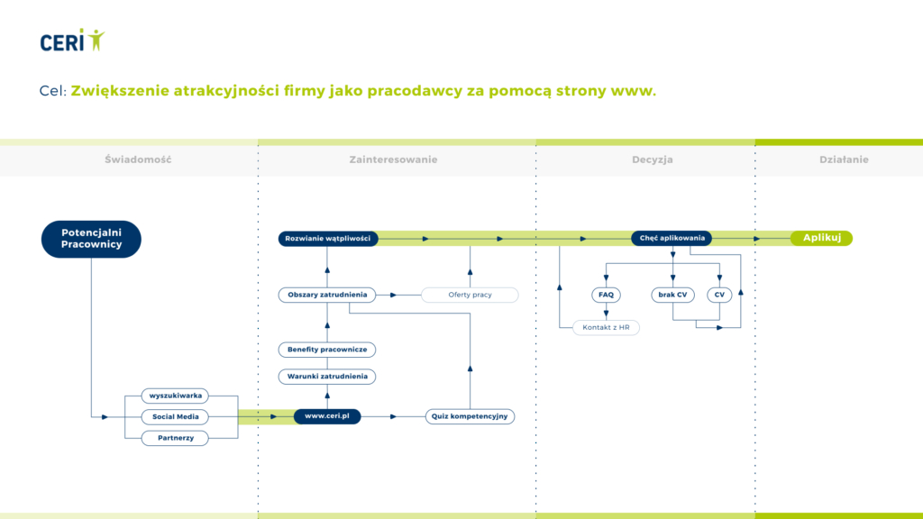
We started our work with a thorough analysis of the client’s website in terms of its business logic and user paths. The knowledge we gathered at this stage helped us understand the context in which the organization operated. An important element of the analysis was also the UX usability research we conducted for the main conversion paths.
Desk research
The next step we took was preliminary research, which we divided into analyzing website statistics using Google Analytics and conducting interviews with the Client’s team regarding different user groups. As a result, we were able to name and describe individual audience segments and list their key needs in bullet points.
UX/UI Design
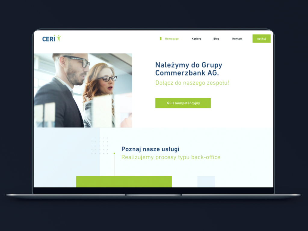
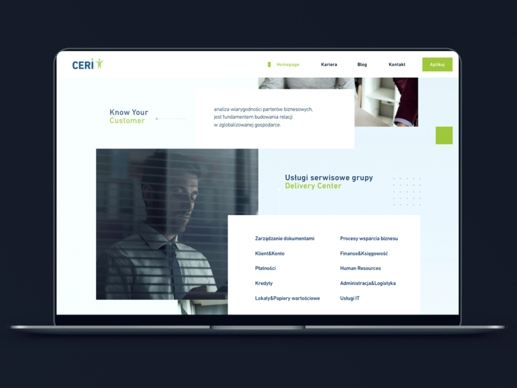
Understanding the goals (thanks to the developed strategy) and knowing the proper user context (thanks to Desk research), we were able to move on to the UX design phase. First, we sketched out a general scheme of the website mechanics, showing from a bird’s-eye view the main user paths and the division of the site into thematic modules. In the next step, we designed mockups of individual pages and a completely new look and feel for the service.
Development
After the design stage, where we planned in the smallest details how the new website will function, we moved on to the development stage, where we selected the appropriate technologies. We opted for WordPress Development using only 2 plugins: ACF PRO and WPML. Thanks to this choice, we created a convenient and easy-to-use admin panel, and the website itself has many advantages:
- Easy editing: Without technical programming skills, you can easily create, edit, and manage content on the website.
- Minimizing plugin usage – too many plugins can slow down websites, affecting page loading time and overall performance, so in every project, we limit them to the necessary minimum.
- Modern technological stack: We applied a modern development environment for the website (JavaScript ES6+, PHP 8, WebPack 5). Additionally, through advanced configuration of ACF PRO, we created custom fields for editing the site and loaded them only when needed, contributing to better site performance.
- Performance optimization: We optimized the website for Core Web Vitals, allowing us to improve user experience and enhance the site’s search engine rankings. We adhered to guidelines for metrics such as LCP (Largest Contentful Paint), FID (First Input Delay), CLS (Cumulative Layout Shift), and INP (Interaction to Next Paint).
- Customizing the admin interface: Thanks to ACF PRO, we were able to extensively customize the admin panel, adapting it to the specific needs of the project.
- Collaboration between designers and developers: UX/UI designers can design new sections and functional modules without technological limitations, and developers can easily integrate them into the theme.
- Multilingualism: To handle multilingual support (PL/ENG/DE), we installed the premium version of the WPML plugin (WordPress Multilingual Plugin). This is a popular WordPress plugin that allows for creating multilingual websites and stands out for its high compatibility with various types of content, collaboration with translators, and SEO-friendliness.
Quality Assurance (QA)
After completing the Development stage, we moved on to the project testing phase, which involved ensuring the high quality and reliability of the website through testing, bug identification, and verifying that all established standards and requirements were met. We conducted tests such as:
- Functional tests: We verified if all interactive elements and functions of the website are working as expected.
- Compatibility tests: We made sure that the website displays and functions correctly on various web browsers (e.g., Chrome, Firefox, Safari, Edge) and devices (computers, tablets, phones).
- Responsive tests: We verified if the website is properly responsive, meaning it adapts to various screen sizes to provide an optimal user experience on both mobile and desktop devices.
- Performance tests: We worked on the page loading time, speed of operation, and efficiency to ensure that the website functions smoothly even under high loads.
- Security tests: Testing the website’s security to detect potential vulnerabilities and threats that could expose the site to hacking attacks or data breaches.
Project summary
Thanks to the joint work with Ceri’s marketing team, we have achieved the following results:
- Over 50% faster and better optimized website, meeting all Core Web Vitals criteria.
- Completely new lead generation module for job candidates.
- Significantly better reception and usability of the new website.
- Increased data security – WordPress regularly provides security updates, and by limiting the number of plugins to the necessary minimum, we drastically reduce the risk of security vulnerabilities and susceptibility to hacking attacks.
- Easier maintenance – using a modern working environment and current technologies facilitates maintaining the website now and in the future.
- Flexible CMS panel that facilitated and accelerated the work of teams responsible for communication.
- The new website is SEO-friendly: well-written semantic code, implemented Schema tags, and configured and provide a solid foundation for further active site positioning.
Codeq delivered the site on time and according to the client’s requirements, resulting in an increase in the number of new candidates for the client’s company. The responsive team fostered a collaborative environment and remained accommodating to the client’s needs and vision for the project. They are really a brilliant agency with top organization standards and a great team.


