Ideal Beauty is a prestigious aesthetic medicine clinic located in the Warsaw, specializing in modern beauty treatments. The team of experts, with many years of experience and using advanced technologies, provides the highest level of services, which has earned recognition among loyal clients. The goal of the project was to completely rebuild the website.
Table of contents
Designing and implementing a website for the aesthetic clinic was a complex process that involved three main stages: Discovery, Design, and Development. Each of these stages had its specific challenges and goals that required precise planning and execution.
Who for? User Persona.
A key task was to understand who the primary audience of the clinic’s services was. To create an effective website, it was necessary to define the user profile and their expectations.
- Client Profile: Individuals aged 27-60, primarily women, but also a growing number of men seeking professional aesthetic services.
- Expectations: Users expect effectiveness, professionalism, and safety of treatments. It is crucial for the website to address their questions and dispel any doubts, such as regarding the effectiveness of treatments.
- Preferences: Most clients come for a specific treatment, often for health or sports-related reasons.
- Location: Clients mainly come from Warsaw and its surroundings, which highlights the need to emphasize the clinic’s convenient location in the city center.
User Persona
A persona is a prototype of a user described through various characteristics (e.g., age, gender, position, experience, skills, etc.). It is a model of a person that defines their needs and goals related to visiting the website. However, it is important to remember that a persona is a fictional character created solely to imagine what a specific user/client might look like.
Why? Project Goals.
Defining clear project goals is essential for the website to effectively meet the clinic’s business needs. The project focused on increasing conversions and modernizing the clinic’s image.
- Increasing conversions: Enabling clients to easily contact the clinic by placing conversion points such as phone numbers and contact forms prominently on the website.
- Generating traffic: Sales traffic will primarily come from performance marketing activities, supported by SEO, a blog, social media, and a newsletter.
- Modernizing the Clinic’s online image: Building a modern website that refreshes the clinic’s image while maintaining key business objectives.
- Implementing multilingualism: Enabling adaptation and management of the website in various language versions, including English and Ukrainian.
- Restructuring the price list: Enhancing clarity and intuitiveness of the complex price list for users.
- Positive Customer Experience: Creating a clear, professional, comprehensible, and trustworthy interface, which is crucial in the aesthetic medicine industry.
- Professionalism and trust: The website must emphasize the clinic’s competence through substantive content, certifications, location, and years of experience.
- Personalized communication: The website should focus on the team, equipment, and certifications—social proof elements that build the clinic’s value.
Social proof
Social proof is a psychological phenomenon where people derive cues on the appropriate behavior or decision based on the actions and opinions of others. In the context of building a website aimed at increasing conversions, social proof plays a crucial role in building trust and convincing visitors to take desired actions.
An aesthetic clinic carries more weight than, for example, hairdressing services because it involves interventions in the body and health. Therefore, the website must be substantive and trustworthy, written in clear and understandable language that supports the user in making a decision about a given service. A strong point in the customer experience is, for instance, the great atmosphere in the clinic, very tasty coffee served on-site by the staff, and friendly and open service that has plenty of time for each client. All this provides a sense of care and a good atmosphere—”competent, but human.” It was also worth emphasizing the clinic’s intimacy to appeal to clients who have had negative experiences with large clinics.
What could go wrong? Project Challenges.
Every project faces potential difficulties that could impact its execution. The sooner these are identified and addressed, the less likely they are to negatively affect the entire project process. In other words, if you feel like sweeping something under the rug—this is the moment to mention it.
- Complex information architecture: Creating a website that effectively showcases the clinic’s wide range of services required a well-thought-out information architecture.
- Optimization of the conversion path: Developing an effective conversion funnel that would guide users from their first contact with the website to finalizing a booking or purchasing a service.
- Balancing aesthetics and functionality: Maintaining aesthetics and visual lightness while presenting rich content on the site.
- Adaptation to dynamic project changes: Flexibly adjusting the project to changing requirements.
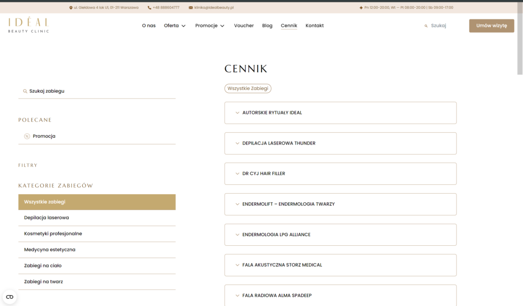
- Price list presentation: The current form of the price list is too complicated and needs to be redesigned to be more intuitive. Possible solutions include integrating a search function or restructuring the price list on the site.
- Promotion of services: Aesthetic medicine is regulated by laws that limit promotional possibilities. A balance must be found between effective promotion and compliance with regulations.
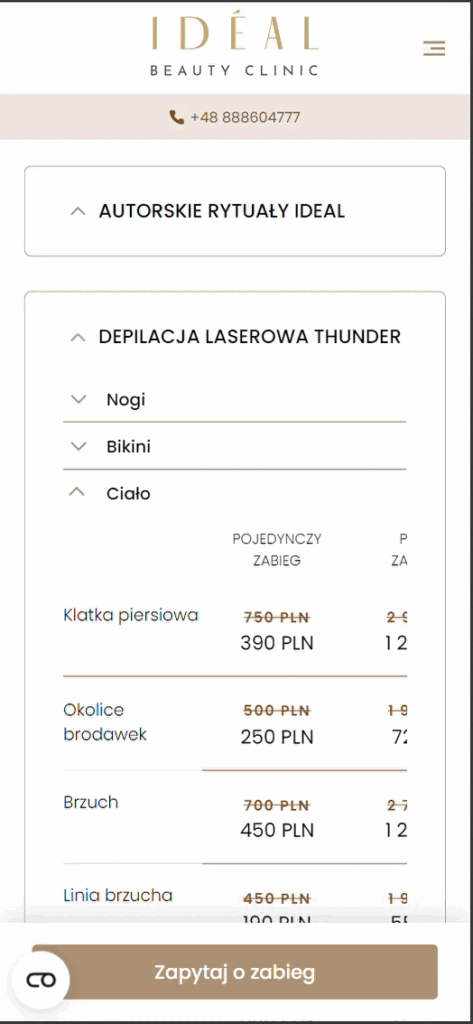
- Omnibus: Promotion through striking out old prices, although effective, must comply with regulations, which requires careful consideration of the pricing presentation strategy.
How did we manage? Implemented solutions.
In response to the challenges encountered, we implemented a range of solutions that ensured the project’s success. Through a strategic approach to UX Design and UI Design and programming the website from scratch, it meets all previously set goals.
- Discovery workshops: We organized a project workshop to align knowledge between us and the client. The outcome was the development of a strategy and the definition of a comprehensive architecture, the logic of the new website, and the creation of a clear navigation structure that groups services into intuitive categories and subcategories.
- Strategic placement of CTAs: Placing clear Call-to-Action (CTA) buttons at key stages of the user journey.
- Modular approach to UI: Using reusable modules and components to ensure visual and functional consistency.
- Easy content management in WordPress: Utilizing the Gutenberg visual editor for content management.
- High-Quality code and fast page load speed: The website was programmed by an experienced WordPress Developer, ensuring the highest comfort for both the editors of the new site and its visitors. The website loads quickly and without delays.
Discovery, Design and Development
Discovery Phase
In the Discovery phase, it is crucial to define the business assumptions and goals of the website, such as increasing sales conversions, improving brand image, and enhancing user engagement. During this stage, we focus on the users: their needs, goals, preferences, and problems. We identify constraints and risks related to technology, budget, and schedule. Finally, we develop an action plan, encompassing design stages, implementation, and preparation of necessary materials.
The main challenge for Ideal Beauty was maintaining a professional and luxurious image while simultaneously highlighting the clinic’s openness and unique atmosphere. Additionally, increasing conversions by effectively encouraging visitors to take actions such as booking appointments, directing traffic to the Price List subpage, or signing up new users for the newsletter.
Design
The design process of the website includes several key stages. Information architecture involves ensuring a logical layout of content that makes it easier for users to find the information they need. In the UX Design stage, we focused on logically arranging the elements and sections needed on the website, which allows for early testing and adapting layouts according to a defined user journey, thereby increasing conversions. Next, in the UI Design phase, we concentrated on developing an attractive and visually consistent interface that reflects the professionalism of the clinic—we gave the entire site the Ideal Beauty brand style.
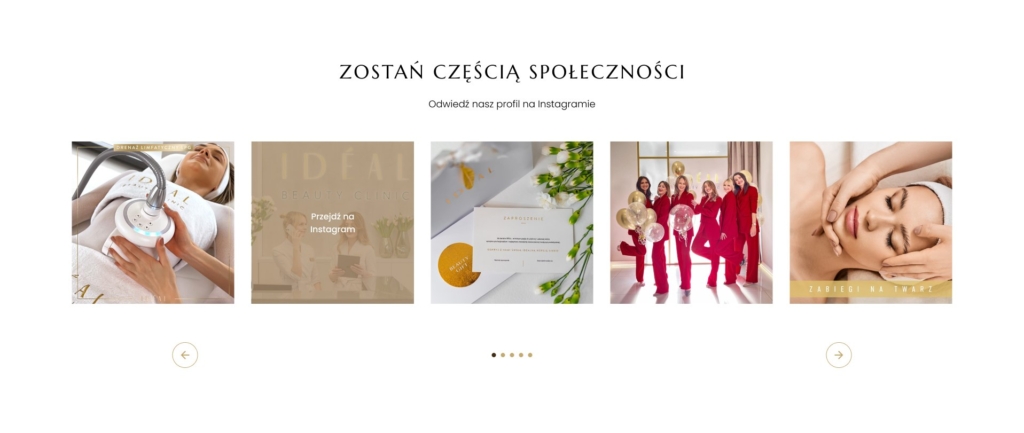
During the design process, we encountered various challenges. The key task was to create a structured price list that is easy to navigate and compliant with UX principles. We also ensured a consistent appearance across different subpages and designed the site in the spirit of reusable modules (i.e., building new subpages is akin to building with blocks). Balancing UX and UI requires harmonizing the client’s requirements with good user practices and aesthetics.
Development
In the Development phase, we implement solutions based on our expertise and experiences from previous projects. The website was built on WordPress, and content management is intuitive for the client, combining ACF and Gutenberg. For multilingual support, we configured the WPML plugin, which increases the website’s accessibility and reach. Additionally, we created a custom blog post liking system that enhances user interaction and simultaneously builds social proof for the brand.
Additionally, we paid a lot of attention to ensuring UX compliance by precisely planning user journeys and placing CTAs. The entire process resulted in creating a website that is functional, aesthetically pleasing, and in line with both business requirements and user needs.
Quality Assurance (QA)
In the Quality Assurance (QA) phase, we conducted detailed tests of the website’s functionality, compatibility, and performance. The goal was to ensure that all elements function correctly and align with the Figma design. A manual tester verified the functionality and responsiveness on various devices, such as smartphones, tablets, and desktop computers. Regular monitoring allowed us to identify issues promptly and ensure the smooth operation of the website.
Analytics and HotJar
For the analysis and optimization of user experiences on the website, we used analytical tools such as HotJar, and for future client analyses, we implemented GTM and Google Analytics 4 (GA4) tracking codes.
HotJar allowed us to track user behaviors, such as clicks, scrolling, and interactions with specific elements of the site. With this data, we could effectively optimize UX, tailoring the website to the actual needs and expectations of visitors. Meanwhile, GA4 will provide detailed data on website traffic, which will help us assess the effectiveness of marketing activities and make data-driven decisions in future project stages.
Results
The website combines functionality and aesthetics, effectively achieving business goals. During the Discovery phase, we precisely defined objectives, such as increasing sales and improving brand image, and identified user needs and project risks. The design ensured a logical content layout, an attractive interface, and an intuitive price list. In the Development phase, key technologies such as WordPress and WPML were implemented, enabling flexible content management and multilingual support.
All these stages collectively contributed to the creation of a website that meets high user and client expectations, providing an excellent user experience and business efficiency.
Continuous improvement
As part of continuous improvement, we provide the clinic with technical support through regular updates of WordPress and plugins, as well as addressing additional changes and elements signaled by the client. This ensures that the website remains secure, stable, and compliant with the latest technological standards. Regular updates allow us to implement improvements continuously and ensure optimal functionality of the site.
One of the biggest development challenges was creating a complex price list with a search function, categories, promotions, and numerous CTAs. The tabular arrangement of this element required precise data structure alignment, performance optimization, and ensuring responsiveness so that the price list functions smoothly on various devices.
We collaborated with Codeq on redesigning our WordPress website, and I can wholeheartedly recommend their services. The team’s engagement, experience, and attention to detail made the entire process smooth and efficient.


